Everyone knows what a bad hair day is. Well, the idea that some days things just don’t work out can be applied to pretty much everything. Today was a “bad code day”.
Composite indicator development, combined with the uncharted vastness of R’s library of packages, presents all kinds of opportunities for interesting data visualisations. One very useful package, Plotly, is an extensive collection of interactive graphs, built using javascript libraries (notably d3.js). The resulting plots can be embedded into R Markdown documents.
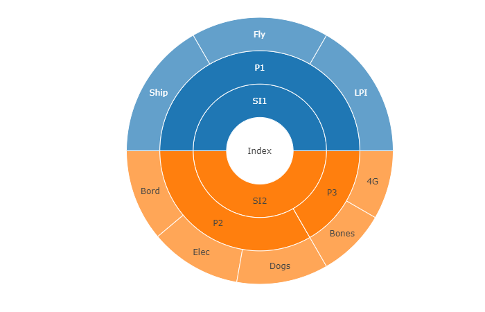
Plotly includes “sunburst plots”, which visualise hierarchical data - which of course is right up the alley of composite indicators. The syntax for specifying a sunburst plot in Plotly is a little awkward, but I thought that it shouldn’t take too long to build a wrapper function which translates a composite indicator structure, plus specified weights, into a nice sunburst plot to show the structure and the effective weight of each indicator and aggregate.
It didn’t quite go to plan.
I am still not sure whether this problem was a “wolf in sheep’s clothing”, or I was just not thinking very clearly. Either way, it took several solid hours of coding, reading documentation, and numerous cups of coffee to get it working. The tricky bit is that you have to navigate over aggregation levels, over aggregation groups, and end up with a set of effective weights that multiplies the weight of the indicator or aggregate by its own weight, plus those of all its parents.
Anyway, all’s well that ends well, and though the code is not going to go down as the most beautiful ever, it seems to work. Here’s a little demo plot for a toy data set. Click on the segments to see it smoothly morph from one level to another. Nice eh?
The code will be up on my Github at some point - they are being integrated into a wider package so are not yet fully fit for consumption :)