
Here’s something that crops up all the time in indicators, but is discussed less than you might think. It’s also more complicated than it looks.
Denomination, despite the way that it sounds, is not about practices found in the murkier corners of the internet. It refers to the operation of dividing one indicator by another. But why should we do that?
Size matters
As anyone who has ever looked at a map will know, countries come in all different sizes. The problem is that many indicators, on their own, are strongly linked to the size of the country. That means that if we compare countries using these indicators directly, we will often get a ranking that has roughly the biggest countries at the top, and the smallest countries at the bottom.
To take an example that is almost absurd, consider employment. If we want to compare the employment between different countries, one possibility would be to measure the number of people in employment. I downloaded the OECD employment data for OECD countries, for Q4 2019 (the latest quarter for which all countries had reported data). Below is a sorted bar chart simply showing the number of employed people for each country (using Plotly).
All the top countries, by this metric, are simply the ones with the most people in: the USA, Russia and Japan. Now, let’s denominate this indicator. In this case, it is divided (denominated) by working-age population. Here’s what we get:
Now the picture is completely different. The highest employment rate, i.e. employed people per unit population, is in the Netherlands, followed by Japan and New Zealand. What we are looking at is essentially a measure of employment per capita. This measure is now (mostly) independent of the size of the country.
The rankings here are completely different because the meanings of these two measures are completely different. Denomination is in fact a nonlinear transformation, because every value is divided by a different value (each country is divided by its own unique population value). That doesn’t mean that denoninated indicators are suddenly more “right” than the before their denomination, however. While employment rate is probably more often compared across countries, the total number of employed people might also be interesting in terms of measuring total labour force capacity and in absolute comparisons between countries. It is also of course a useful statistic to the country for internal matters.
What is important is that the indicator is suited to its purpose and context. More often than not, in international indicators and scoreboards, the most suitable indicators are those that are denominated, so as to make meaningful comparisons between countries of different sizes.
Intensive vs. extensive
More precisely, indicators can be thought of as either intensive or extensive variables. Intensive variables are not (or only weakly) related to the size of the country, and allow “fair” comparisons between countries of different sizes. Extensive variables, on the contrary, are strongly related to the size of the country.
This distinction is well known in physics, for example. Mass is related to the size of the object and is an extensive variable. If we take a block of steel, and double its size (volume), we also double its mass. Density, which is mass per unit volume, is an intensive quantity: if we double the size of the block, the density remains the same.
- An example of an extensive variable is population. Bigger countries tend to have bigger populations.
- An example of an intensive variable is population density. This is no longer dependent on the physical size of the country.
The summary here is that an extensive variable becomes an intensive variable when we divide it by a denominator.
Simple?
So far, this is fairly intuitive. It is obvious when to use population density rather than population, and when to use employment rate rather than the total number of employed people.
Some cases are more tricky. Take innovation. One typical indicator of innovation is the number of academic articles published in (top) journals. But obviously, this is an extensive indicator: bigger countries will be able to publish more papers. So, what to do?
Well, to publish papers you need at least (a) people to write the papers, and (b) money to fund the research. This suggests that publications are linked to both population and the economic size of the country, i.e. GDP. So which one is the best to dominate by?
As with most things, it depends, and the meaning will change depending on which denominator you use, so that should be very carefully considered. A statistical way of looking at it, however, is through correlation.
Let’s take some data from our ASEM Sustainable Connectivity Portal. We have international publication data for 51 ASEM countries, as well as population and GDP values, and a simple measure of GDP per capita by dividing one by the other. Here’s what it looks like (using the reactable package):
We can check and visualise the correlations between these different variables using the ggally package:
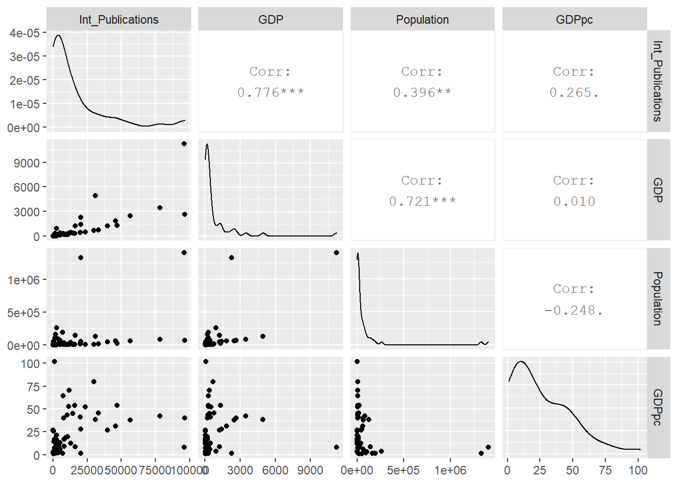
Now we can see that international publications are most strongly linked to GDP, with a highly-significant correlation of 0.77. This is no proof of causality (we can’t conclude that more GDP causes more publications), but the two clearly have a strong link. Common sense also tells us that money is handy in generating more research. This might point to the fact that if we want to remove the “size effect” in this case, we should consider denominating by GDP rather than population.
Concluding
Denomination is a simple operation but it needs to be handled carefully. You need to understand what the final meaning of the indicator actually is, and ensure that it fits with what you are trying to measure. It’s surprisingly easy to slip up. Correlations can help to point to available options. The most common denominators include population, GDP and land area, but there could be potentially many others.
So, the big question: does size really matter? Well it depends: for extensive variables it does, and for intensive variables it doesn’t.